

I have some swatches of the Chanel Les 4 Ombres Boutons ($86, limited edition) in 239 Boutons Baroque to share with you. I literally just got this in the mail about an hour ago, so I haven’t used these on my eyes. Update August 19, 2025: Scroll down for my review and comparison swatches with the Chanel Single Eyeshadow Peche Glacee and the Tom Ford Golden Hour Quad. But as I’ve said in the past, it can be hard to find Chanel swatches on someone with a similar skin tone. Since this collection is limited edition, I wanted to go ahead and share the swatches. I have a warm olive, medium-deep skin tone (sometimes medium or tan, depending on the shade range). My best foundation matches for shade reference are NARS Natural Radiant Longwear Tahoe and Estee Lauder Double Wear 4W4 Hazel.
The Chanel quads come with a velvet pouch, and the pouches for each of the 4 quads in this collection have a different design, so I wanted to include a picture of it.
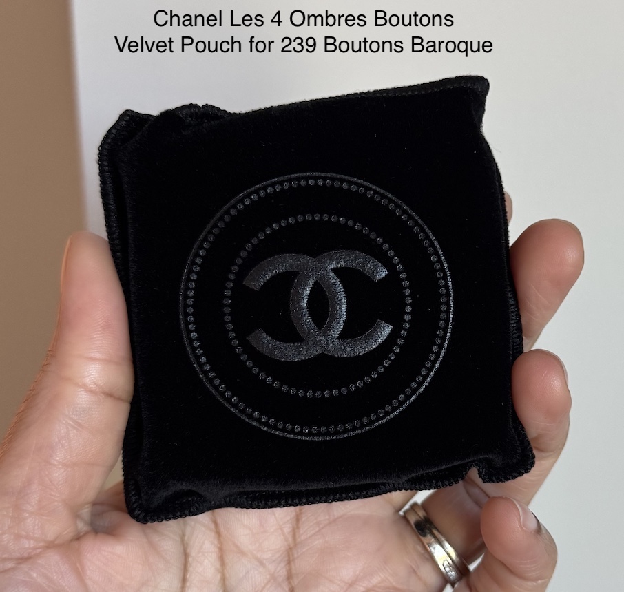
Swatches of Chanel Les 4 Ombres Boutons in 239 Boutons Baroque ($86)

Update August 16, 2025: I responded to a comment from Lili the day after I purchased the Chanel 239 Boutons Baroque quad, since I had tested a couple of looks the night before. Here is that comment: After testing some looks, I agree completely, for my skin tone, Baroque is mostly a quad of single shades. I don’t love how the shades look on me when I pair them together, with a couple of exceptions. So I need to pair this with other singles or palettes. That sucks for the price, but I think my undertone has a lot to do with it. The gold and light pink also come across a lot lighter on my skin than I expected.
Update August 19, 2025: I wanted to share my thoughts after using this a couple more times since then. Whether it is due to my olive undertone or the depth of my skin tone, I don’t like the shades in the Chanel Boutons Baroque Quad as much as I thought I would. Since getting this quad, I have tried it with different eye primers and eye bases, and it is just not pigmented enough for me. Even if I am willing to go for a softer look, I still don’t like how the shades appear on me. The gold is too light, so it looks icy. The light pink is too light, so it also looks icy. The purple is too sheer, so it almost looks ashy, and building it enough to get a soft look that doesn’t look as ashy is annoying. Then what Chanel is describing as a red copper just looks like a medium pink on me, although this is the best shade for me in the quad. However, I thought I would get more depth from it, so it still disappoints.
My go-to primer (MAC 24HR Prep and Prime Eye Base), which I rely on to give eyeshadows more impact, doesn’t improve how I feel about these eyeshadows. I also tried them with the Urban Decay Primer Potion just to see if they got along better with a different primer, and that didn’t improve anything. I tried using these over a more skin-toned shade of eyeshadow base (MAC Contemplative State Paint Pot) to see if that would help. Nope. My last attempt was trying it over a base that was lighter than my skin tone (Laura Mercier Caramel Caviar Stick). Still a no. Not everything works for everybody, and the Chanel Les 4 Ombres Boutons in 239 Boutons Baroque does not work for me.
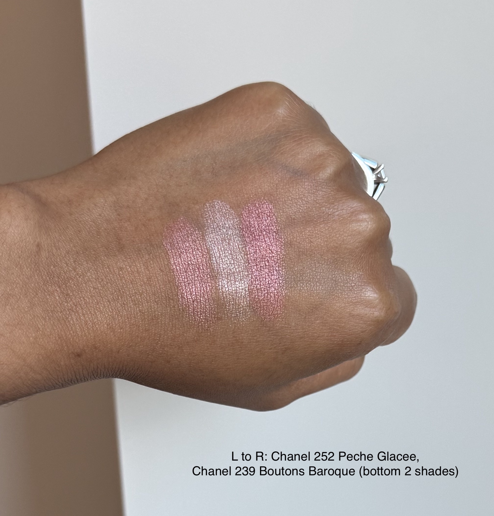
Comparison Swatches (Chanel Peche Glacee Single and Tom Ford Golden Hour Quad)
I wanted to compare this to both the Chanel Ombre Essentielle Single Eyeshadow in 252 Peche Glacee and the Tom Ford Golden Hour Quad (reviewed here), since they are close to the pinks in the 239 Boutons Baroque Quad. I don’t have anything similar to the purple shade, so there are no comparisons for that.


One last thing that isn’t super important, but I thought I’d still share for anyone curious about it. The embossed button design is already pretty worn down. The darkest shade still has the most detail left.

I ordered my quad directly from the Chanel website with an early access link from Sofia Sees Beauty on YouTube. Update September 7, 2025: Once the collection officially launches, you should be able to find it The collection is now available at **Bloomingdale’s and **Nordstrom.
If you’d like to check out more of my content, here are some places to start.
- Blush Index
- Brands A-Z
- Bronzer & Highlighter Index
- Brush Index
- Concealer Ranking
- Eyeshadow Index
- Foundation Round-Up
- Lipstick Index
- Makeup Storage and Organization Ideas
- My Favorite Makeup
- Powder Round-Up
Disclaimer: I purchased all products featured with my own money. This site receives a minimal commission from participating in the WordAds program and using affiliate links (marked with **). For my full disclosure policy, click here.

I was so torn between this Boutons one you bought and the Couture. Couture appeals to my love of deep browns and Boutons appeals to my love of color. I already own the Tweed Cuivre, so Boutons would be more unique for my collection…but I don’t see myself making eye looks exclusively with the shades in Boutons as they seem like nicer one-and-done shades. I don’t ever do one-and-done eyeshadow looks though. The pigmentation in Couture seems a lot stronger, which I like to see coming from a brand like Chanel, but I do already have a brown quad I love (YSL’s Over Brun). Ultimately, even though Boutons is more unique, I think I might still use Couture more often. So, that’s what I ended up picking. And in the very rare chance that maybe these aren’t as limited edition and low quantity as everyone says or if for some wild reason it goes to a retailer in Germany that has sales…I feel like I’d have a better chance of getting a discount on Boutons over Couture. I probably won’t, but there is at least a small shot I could end up with Boutons too.
LikeLiked by 1 person
After seeing more swatches, I kind of wish I had ordered Couture because it does look more pigmented than Baroque, but I love to see pink and purple tones paired together, so that won out. After testing some looks, I agree completely, for my skin tone, Baroque is mostly a quad of single shades. I don’t love how the shades look on me when I pair them together, with a couple of exceptions. So I need to pair this with other singles or palettes. That sucks for the price, but I think my undertone has a lot to do with it. The gold and light pink also come across a lot lighter on my skin than I expected.
LikeLiked by 1 person
That’s good to know also. Light pink shimmers rarely look pink on me and typically just whitish or silver, so it sounds like that would probably happen on me too.
LikeLiked by 1 person