

This is just a quick one today. I wanted to share swatches of the Natasha Denona Bloom Eyeshadow Palette ($69). I have seen a couple of people compare it to the Sigma Cor-de-Rosa Eyeshadow Palette, but I don’t think they’re that similar. I did swatch a few of the shades that were “close,” but overall, the Sigma Cor-de-Rosa palette is more colorful and warmer. If you already own the Cor-de-Rosa, I can understand why you might feel it has a similar vibe. If that is the case, and you enjoy using your Sigma palette, I’d let that be good enough and pass on purchasing the Natasha Denona Palette. As a makeup lover, it can be easy to justify slight shade differences, but I genuinely don’t think these two palettes will create the same looks. At least not on my skin tone. However, if you are more concerned about utility (which isn’t bad), this could be a pass for you. They will be at the end if you are interested in the comparison swatches.

For shade reference, my best matches are NARS Tahoe and Estee Lauder 4W4. I am typically the lightest shade in the medium deep category or between that shade and the next shade lighter. I have a warm olive undertone that can make a more significant difference in how colors appear on me than how dark I am considered. Just some things to keep in mind.
I took pictures of swatches in two types of lighting because I had trouble getting the natural light pictures to show the colors as I saw them. I’ll explain the takeaway from each kind of lighting when we get to it. Ok, let’s get into the swatches.
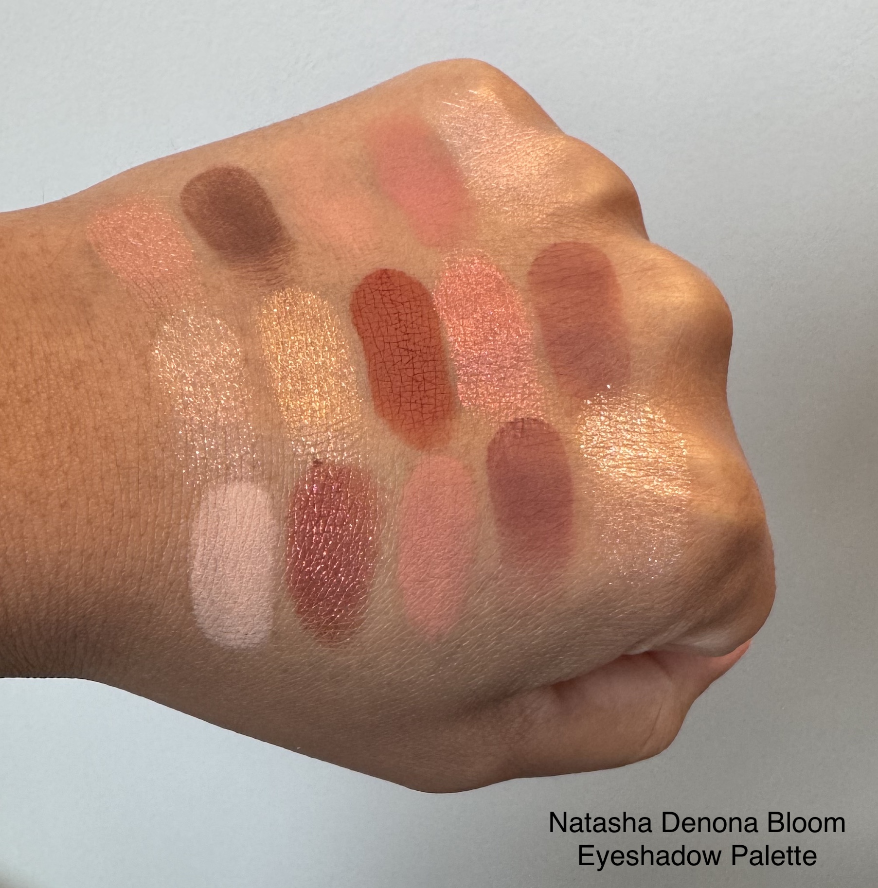
Natasha Denona Bloom Eyeshadow Palette Swatches – warm artificial lighting
This lighting shows the colors as I see them in person. Always remember that everyone sees color differently, and each device’s screen will vary. This lighting also showcases the larger glitter particles are in the shades, crisp, lush, ember, and equinox. The downside of this lighting is that it doesn’t show the shine and dimension quite as well as natural lighting.
Please refer to the image of the open palette above for the shade names.

Natasha Denona Bloom Eyeshadow Palette Swatches – natural lighting
In this lighting, the shades are too saturated compared to how they look in person. However, the dimension, shine, and pigmentation are more accurate.
Please refer to the image of the open palette above for the shade names.


I am in no position to review this palette, but I did want to share my initial impressions. So far, I’ve only used two mattes (bark and keen) and three shimmers (florescence, rue, and ember), so I’ve barely scratched the surface. The mattes are a little dustier than the ones in the I Need A Warm Palette, but they still perform like I expected. Ember has a flaky texture and looks a little patchy up close in the mirror, but I couldn’t see any issues from a regular distance. The texture made me worry it would have a lot of fallout, but I didn’t have any problems during application or wear. I don’t have any fading or creasing with the Natasha Denona formula and the shades I’ve used from the Bloom Eyeshadow Palette are no exception.
Update November 2025: To see two eye looks from the Natasha Denona Bloom palette, you can check out my 2025 Makeup Favorites Post.
Update May 10, 2025: Niva asked me in the comments if the palette is powdery and how I would compare the quality to other Natasha Denona palettes. Here is my response:
In my experience, I wouldn’t call anything in this palette powdery. I think of older ABH palettes and Lorac Pro when I think of powdery shadows. Older palettes from Natasha Denona aren’t as fresh in my mind, so it is hard to compare the Bloom palette directly to older releases I’ve tried (camel, sunrise, my dream, mini bronze, mini biba). The I need a warm palette is the only other palette from Natasha Denona that I have right now. Compared to I need A Warm, the Bloom Palette mattes have a little more dust up when I dip my brush in the pans. But they aren’t messy or dry, and blend and build easily for me. I do notice that there is less dust up when I use a synthetic blending brush, but the style and shape of the brush could have also caused that. The shimmers haven’t given me any issues, and fallout has been minimal. I have found that Natasha Denona shadows last better for me and have less creasing with MAC’s Prep and Prime 24HR eye primer and Urban Decay Primer Potion. I get creasing after about 3 hours when I use it with the Milani Eyeshadow primer. I don’t notice a quality difference between the Bloom Palette and anything else I have tried. They are all good quality, but there is some variance in each one in terms of the formulation of each shade. That isn’t unique to Natasha Denona, just something to keep in mind.
Update – March 25, 2025: Mumtaza asked a great question (see the comment section below), so I wanted to add my response to the post for more context on the colors from this palette and how they work for me.
Overall, I would say the palette is warm pink, especially if I narrow in on the undertone of the shades as I am looking at them in the pan rather than how they look when I wear them. But of course, we want to wear the eyeshadow and not just look at it in the palette.
So on my skin tone and considering I like a shimmer on the lid, I’ve gotten a couple of pink looks (rue and fleur), a peach look (florescence), a brick red look (ember), and a gold look (lush) with this palette. The looks can lean warmer if I use keen, brick, or robin in the crease and bark in the outer-v. The looks can look cooler if I use ren or flos in the crease and clover in the outer-v. But again, this is how the shades appear to me on my skin tone. If I were to do an all matte look, I think I could also get a purple leaning look with clover but it would still lean warm. Crisp and equinox are toppers for me. Crisp pulls pink on me but even when layered over another shade, it’s gold shimmer particles are going to take it in a warm direction. Equinox has blue and pink sparkles that cause it to shift in a cooler toned direction, so you could in theory make the other shades look more neutral or cooler leaning, but I haven’t experimented with that enough to say for sure.
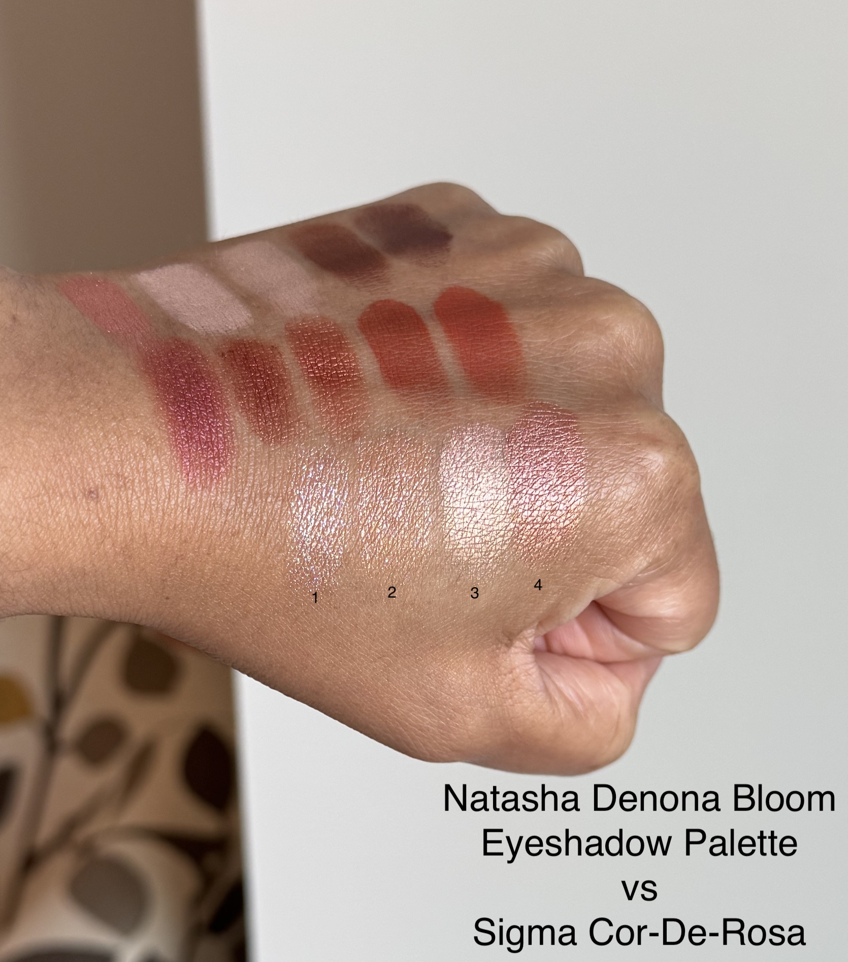
Now for the Sigma comparisons for those interested.
Sigma Cor-De-Rosa Palette Comparison Swatches
You can see the swatches of the entire Sigma Cor-De-Rosa Palette by clicking here.
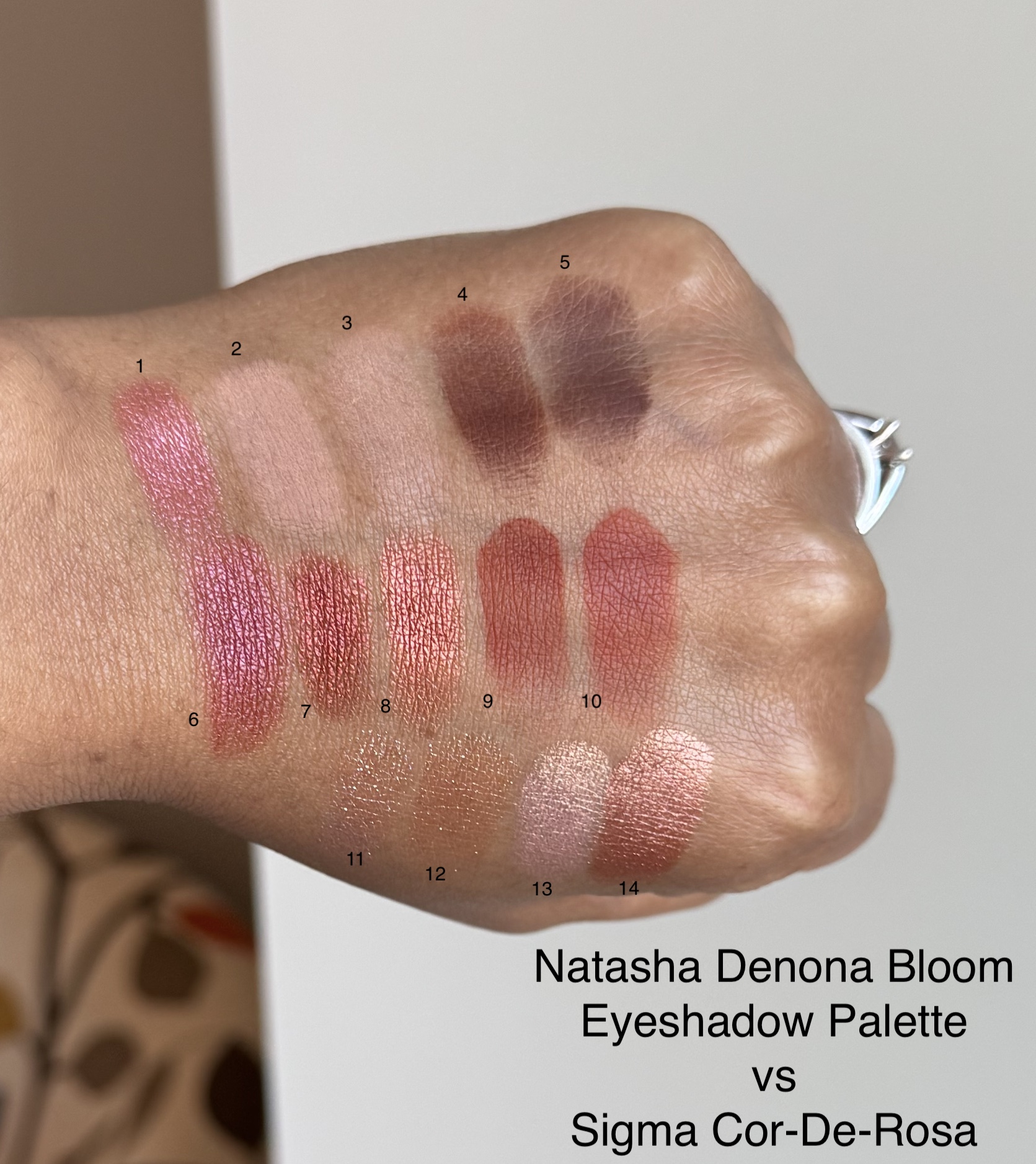
- Natasha Denona Rue
- Natahsa Denona Petal
- Sigma Veranda
- Natasha Denona Bark
- Sigma Bare Root
- Sigma Dark Night (had to build up with 3 layers)
- Natasha Denona Ember
- Sigma High Society
- Natasha Denona Brick
- Sigma Summer Song
- Natasha Denona Equinox
- Sigma Belle of the Ball
- Natasha Denona Fleur
- Sigma Campfire
- Natasha Denona Equinox
- Sigma Belle of the Ball
- Natasha Denona Fleur
- Sigma Campfire
While I can appreciate Sigma’s palettes, I don’t like the formula as much as Natasha Denona’s. So, I would personally prefer to buy the Natasha Denona Bloom Palette over using the Sigma Cor-de-Rosa in its place. Update October 21, 2025: This is especially true now that Sigma’s 14-pan Palettes are $65 compared to $69 for Natasha Denona.
Let me know if you have questions. Thanks for reading. 🙂
If you’d like to check out more of my content, here are some places to start.
- Blush Index
- Brands A-Z
- Bronzer & Highlighter Index
- Brush Index
- Concealer Ranking
- Eyeshadow Index
- Foundation Round-Up
- Lipstick Index
- Makeup Storage and Organization Ideas
- My Favorite Makeup
- Powder Round-Up
Disclaimer: I purchased all products featured with my own money. This site receives a minimal commission from participating in the WordAds program and using affiliate links (marked with **). For my full disclosure policy, click here.

Your blogs are always so well written and thorough. Thank you for the work you put into every post!
LikeLiked by 1 person
Thank you so much! I appreciate you taking the time to share that with me. 😊
LikeLike
Oh my God! I just want to say no one does written makeup reviews anymore! Much less well thought out, thoroughly communicated, and clearly photographed ones, and I am ALWAYS on the hunt for honest, WRITTEN makeup reviews!!
So please, from me to you, I adored this post and please know that you have a much larger audience than you probably know. You may make videos and that’s wonderful, but I prefer thoughtful written reviews that are not entirely PR relationships where the palette is just always “wonderful”, but no thought is given to what makes it unique, and the professional lighting makes all the colors basically repetitive. It just moves too fast for me and I don’t like all the extemporaneous chit-chat even if I like the person making it, lol.
Great post! I will check out more of your content, and I have questions: This palette seems warm and rosy, how would you describe the version of “pink” portrayed in The Bloom Palette overall? Coral? Rose? Warm Pink? Baby Pink to Brick Red Spectrum? I think I want to buy it, but I’m on the fence. Like if you had to sum it up, is it a “pink palette” at all? I know she kinda gave us one of those with “Love”. What are the top adjectives you would use to describe the tones in Bloom?
Thank you!!
LikeLiked by 1 person
Wow! Thank you so much for your comment. I’m happy to hear that you enjoyed the post.
To be honest, this was a hard question to answer and I’ve been thinking on it all morning 😆. Overall, I would say the palette is warm pink especially if I narrow in on the undertone of the shades as I am looking at them in the pan rather than how they look when I wear them. But of course, we want to wear the eyeshadow and not just look at it in the palette.
So on my skin tone and considering I like a shimmer on the lid, I’ve gotten a couple of pink looks (rue and fleur), a peach look (florescence), a brick red look (ember), and a gold look (lush) with this palette. The looks can lean warmer if I use keen, brick, or robin in the crease and bark in the outer-v. The looks can look cooler if I use ren or flos in the crease and clover in the outer-v. But again, this is how the shades appear to me on my skin tone. If I were to do an all matte look, I think I could also get a purple leaning look with clover but it would still lean warm. Crisp and equinox are toppers for me. Crisp pulls pink on me but even when layered over another shade, it’s gold shimmer particles are going to take it in a warm direction. Equinox has blue and pink sparkles that cause it to shift in a cooler toned direction, so you could in theory make the other shades look more neutral or cooler leaning, but I haven’t experimented with that enough to say for sure.
I hope that extra information is helpful and doesn’t make things more confusing. Please feel free to ask me any other questions.
LikeLike
Hi.. How does it perform? Whether the shimmers and matters are too powdery? How do you compare to her previous palettes, is it better quality?
LikeLiked by 1 person
Hi.. Your swatches are very helpful.. Is it powdery? How do you compare it with recent palettes in terms of quality?
LikeLiked by 1 person
Thank you. In my experience, I wouldn’t call anything in this palette powdery. I think of older ABH palettes and Lorac Pro when I think of powdery shadows. Older palettes from Natasha Denona aren’t as fresh in my mind, so it is hard to compare the Bloom palette directly to older releases I’ve tried (camel, sunrise, my dream, mini bronze, mini biba). The I need a warm palette is the only other palette from Natasha Denona that I have right now. Compared to I need a Warm, the bloom palette mattes have a little more dust up when I dip my brush in the pans. But they aren’t messy or dry, and blend and build easily for me. I do notice that there is less dust up when I use a synthetic blending brush, but the style and shape of the brush could have also caused that. The shimmers haven’t given me any issues, and fallout has been minimal. I have found that Natasha Denona shadows last better for me and have less creasing with MAC’s Prep and Prime 24HR eye primer and Urban Decay Primer Potion. I get creasing after about 3 hours when I use it with the Milani Eyeshadow primer. I don’t notice a quality difference between the bloom palette and anything else I have tried. They are all good quality, but there is some variance in each one in terms of the formulation of each shade. That isn’t unique to Natasha Denona, just something to keep in mind.
LikeLike