
I know what you are thinking. My favorite eyeshadow formulas are usually of the hard-pressed variety. Back in June, when I swatched the Sigma Cor-de-Rosa palette for you guys, I pointed out that the matte eyeshadows have a looser formula. While that is still true, I have enjoyed that palette enough to stop caring. So despite knowing the mattes would likely be the same, this Warm Neutrals Palette caught my eye on the Sigma website, and I decided I had to have it.
UPDATE October 21, 2021: In my experience, the Sigma formula is really great for those who like applying shimmer shades with their fingers and prefer a buildable matte eyeshadow. If you are someone who likes super-saturated colors or only likes to apply eyeshadow with brushes, I think these may miss the mark. For a more detailed breakdown, click here and check out my Updated Sigma Eyeshadow Palette Review.
I have only had a chance to use this palette a few times, so I’ve only got initial thoughts and swatches for now. Enjoy!
Sigma Warm Neutrals Palette, $49.00

As expected, Some of the mattes are loose, but to me, they are not as messy as the Anastasia Beverly Hills Shadows. I also switched back to my go-to primer, Too Faced Shadow Insurance, and it works better with these shadows than the Nars Smudge Proof Eyeshadow Base. I’ll tell you a little about the shades that I’ve used. If I skip a shade, it means I haven’t had a chance to try it.
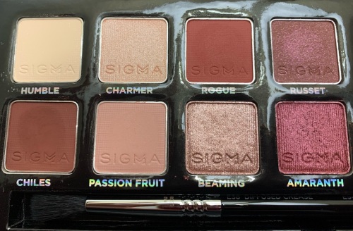
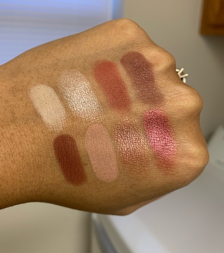
Chiles, Rogue, and Henna are the mattes with a loose press. They pick up on the brush easily, so use caution.
Rouge is a nice change of pace when looking for something different to add interest since it is a little brighter than the other transition shades in the palette.
Russet is a matte base with shimmer running through it and a loose press. I feel like it works like a matte eyeshadow, but the shimmer does catch the light if you pay close attention.
I used Chiles as an outer-v shade, but I can see this working as a transition shade option for those darker than me.
Passion fruit had decent pigmentation with one layer, but I would still consider it to be buildable.
Beaming is slightly sheer and can be used to top off another shade. But it can also be built up as a stand-alone shade.
Amaranth applied with full color both using a brush or just fingers.


Iconic also applied with full color with a brush and fingers.
Toasty has good pigmentation but did need building up for my skin tone.
Henna is a very pigmented mid-tone for deeper skin tones. When applied lightly it performed well as a transition shade for my skin tone. Henna can also be built up for use in the outer-v, so it has some versatility.
So far, the only shade I’ve had trouble with is Bittersweet. It doesn’t work as well with a brush as it does with your fingertip.
Sigma Warm Neutrals VS Sigma Cor-De-Rosa
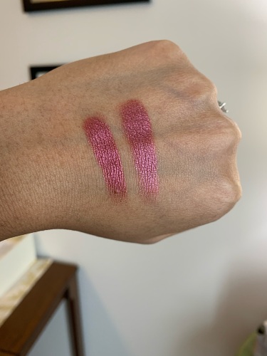
I thought that these two palettes would have more similarities, but they turned out to be quite different. The Warm Neutrals Palette is darker in tone overall, so I find I don’t have to build the shades as much as I do with the Cor-de-Rosa palette. Also, as the name suggests, the Warm Neutrals palette is more neutral than Cor-de-Rosa. When I compared shades side by side, there was only one shade comparison that felt like overlap (Amaranth vs Dark Knight).

Passion Fruit (left side) from Warm Neutrals is not as rich nor as warm as Cor-de-Rosa (right side) from the Cor-de-Rosa Palette.

Here we have Amaranth (left side) from Warm Neutrals next to Dark Knight (right side) from the Cor-de-Rosa Palette. While Dark Knight does have more of a purple undertone to it, once applied these shades are functionally the same.
The last comparison that stuck out to me when looking at the palette didn’t turn out to be close to each other at all. Iconic (left side) from Warm Neutrals is deeper and less pink than High Society (right side) from the Cor-de-Rosa Palette.

So there you have it. If you had your eye on Sigma’s new Warm Neutrals Eyeshadow palette, I hope you found this helpful. If you are looking for swatches of the full Cor-de-Rosa Palette, you can check out that post here.
If you enjoyed this post, please consider sticking around. You can check out my Brands A-Z index if you want to know what products I have posted about in the past.
Disclaimer: I purchased all products featured with my own money. For my full disclosure policy, click here.

I really like the darker palette . It’s really pretty and looks like it would be good for smokey looks.
LikeLiked by 2 people
Agreed. Thanks for reading!
LikeLiked by 2 people